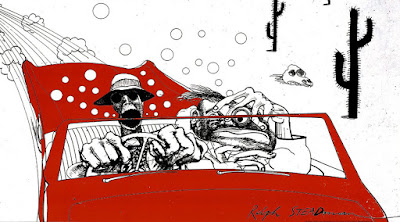
Ralph Steadman "Fear and Loathing"
Ralph Steadman’s “Fear and Loathing”, like most, was originally done in pen and ink and then reproduced by silk screen printing. This illustration was used for Hunter S. Thompson’s book “Fear and Loathing: in Las Vegas”, as well as appearances in the Rolling Stone. The context was to help transport readers into a world of alcohol-soaked, drug-addled madness that became gonzo journalist Hunter S. Thompson’s calling card. Steadman’s frenzied artistic style, illustrations helped to bring that world to life. The intended audience was the counterculture and fringe societies of the 70’s.
Ralph Steadman was born in England. He work in publication illustration, book authoring, product branding, album design, and free lance. He is a member of the Chelsea Arts Club, and recipient of multiple illustration awards. He has backgrounds in multiple styles of art such as ink and pen, screen printing, etching, and painting.
I choose this illustration, because the first time I saw it, I knew I had to have it. This illustration was the soul reason I watched the movie, and read the book. It was chaotic and beautiful, and I wanted more.
